Color, that’s what it’s all about. It’s used to entice us to purchase items. We dress in colors that complement our complexion. And as photographers we always use color even if we process in black and white. This week, Egidio encourages to show us how we use complementary colors in our photography.
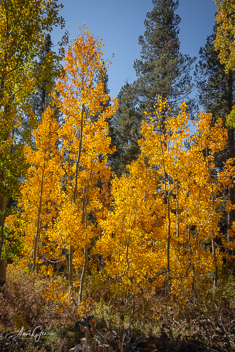
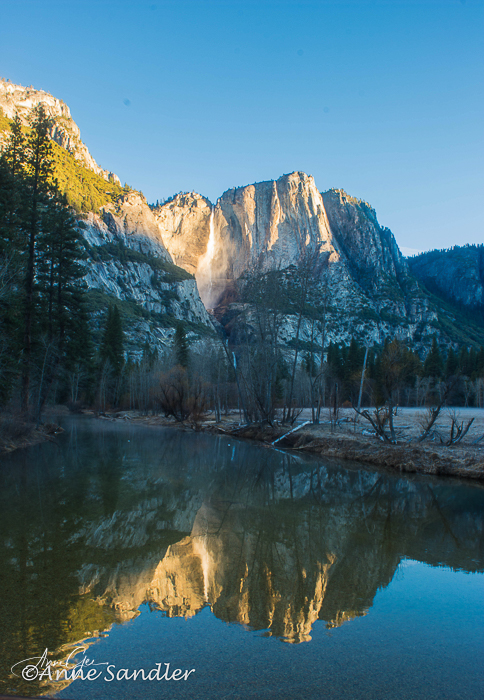
Nature gives us color every time we go out, especially complementary colors. First is green. What doesn’t complement green. On the color wheel colors shades of orange, red and purple complement green when you cast a wide net.
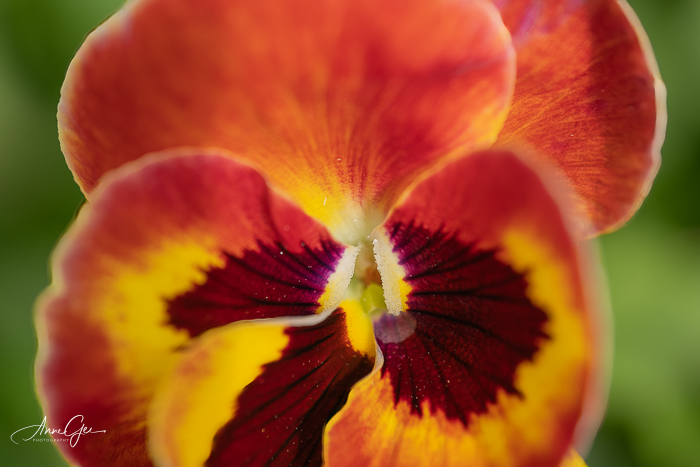
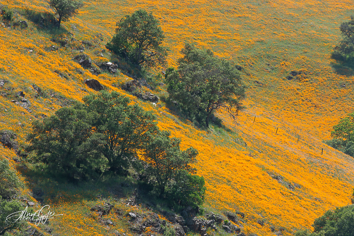
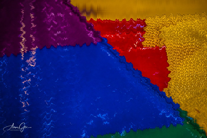
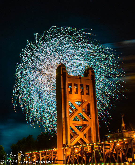
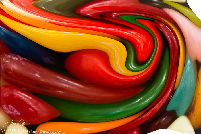
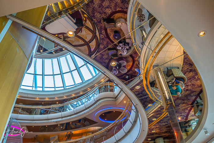
But we humans know how to use complementary colors also. From a seat cushion, to fireworks against a golden bridge, to an abstract and to a ship’s interior.
When you see ads, interior spaces or store fronts, think about how they use color. Thanks Egidio for this wonderful and colorful challenge. When you post your response, please link to Egidio’s post and use the Lens-Artists tag.
I enjoyed seeing your responses to Ritva’s post that had us looking down last week. You gave me lots of ideas! Next week Tina is presenting the challenge, so be sure to look for her post. In the meantime, stay safe and live in gratitude!

These are wonderful colors and examples Anne! I especially like the golden hillside and abstract.
LikeLiked by 1 person
Thanks Brad! Those poppies were a one-time shot. I’ve been back year after year and the coverage hasn’t been the same.
LikeLiked by 1 person
All the better that you experienced it and have a photo to remember it.
LikeLiked by 1 person
What a glorious and beautiful collection of images and colors, they make such wonderful bursts of colors that lift the mood, so fit for the theme. Nature to abstract art. Loved them Anne
LikeLiked by 1 person
Thanks Ritva!
LikeLike
Anne, a complete and perfect response to the challenge. From nature to man-made objects, these are beautiful examples of complementary colors. I loved the photos.
LikeLiked by 1 person
Thanks Egidio! It was a fun challenge.
LikeLike
So glad you liked it. Thanks.
LikeLiked by 1 person
Amazing photos, Anne.
LikeLiked by 1 person
Thanks Rupali
LikeLike
Love your answers to the challenge this week, Anne.
Particularly that abstract swirl of red, green, yellow.
LikeLiked by 1 person
Thanks Vicki!
LikeLike
Just wonderful, Anne.
LikeLiked by 1 person
Thanks Sandy!
LikeLiked by 1 person
You bet!
LikeLiked by 1 person
Love the subjects and the colors. Really made my evening – beauty in many forms.
LikeLiked by 1 person
Thanks N! Your comment made my evening!
LikeLiked by 1 person
Beautiful gallery – the fireworks photo is amazing!
LikeLiked by 1 person
Thanks Nora!
LikeLiked by 1 person
Beautiful clicks. Love the fireworks against the golden bridge! Philo
LikeLiked by 1 person
Thanks Philo!
LikeLiked by 1 person
Welcome, Anne Sandler.
LikeLiked by 1 person
You are so right, Anne, I think we don’t realize the importance of colour in our lives. Great post!!!
LikeLiked by 1 person
Thanks Ana!
LikeLiked by 1 person
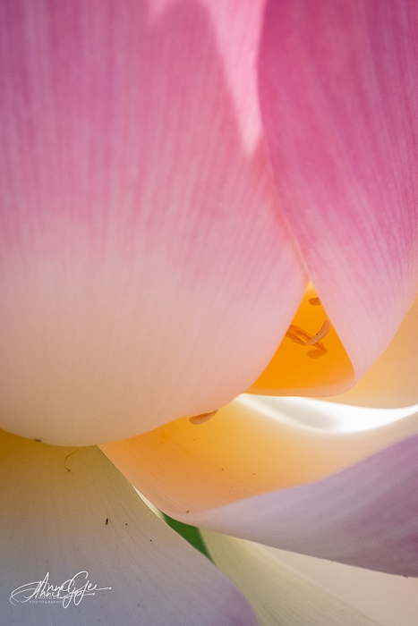
Yay, Anne! I love the abstract and all your nature shots, you always do wonders with nature 🙂 Is that a lotus flower? It’s such an interesting composition, it left me guessing…
LikeLiked by 1 person
Thanks Sofia! Yes, that’s a lotus flower. Each year we’d go down to a pond in Sacramento to photograph them, but the city has pulled them out. I don’t know where we will go this year. Progress?
LikeLiked by 1 person
That is mad! Did they give any reason for it?
LikeLiked by 1 person
No! But it did draw a lot of people to the park.
LikeLiked by 1 person
Wonderful post and selection of photos, Anne! I especially love the flower macro! I can really feel the movement and softness of the flower.
LikeLiked by 1 person
Thanks Donna! This was a fun challenge.
LikeLiked by 1 person
Fabulous examples of complementary colors in these pics, Anne. Are those poppies on the side of the hill in the one shot? I love the orange in Sacramento’s Tower Bridge juxtaposed against the blue fireworks–incredible capture!
LikeLiked by 1 person
Thanks Terri! Yes, those are poppies on that hillside. I’ve been back twice since I took that picture and the hillside hasn’t been that full.
LikeLiked by 1 person
Wow, a lucky capture, then. I do miss the Cal poppies!
LikeLiked by 1 person
A beautiful selection Anne and so lovely to see the orange poppies again 🧡 xxx
LikeLiked by 1 person
Thanks Xenia!
LikeLiked by 1 person
Some amazing pieces here
LikeLiked by 1 person
Thanks I. J.!
LikeLiked by 1 person
Well Anne, this is one of my favorite of your posts ever! I absolutely loved it from start to finish. Your header image is magnificent and your closing image is truly awesome! Great job.
LikeLiked by 1 person
Thanks Tina! I appreciate your comment. Excire is a BIG help in finding forgotten photos.
LikeLike
Great examples Anne, and you made some interesting points too about how advertisers etc use colour theory to lure us into buying 😀
LikeLiked by 1 person
Thanks Sarah! Whether we acknowledge it or not, we are color driven. We don’t live in a black and white world.
LikeLiked by 1 person
I love your two abstracts, the orange and green swirls, and that fabulous shot inside the ship.
LikeLiked by 1 person
Thanks John!
LikeLiked by 1 person
These colorful images are remarkable, Anne!!
LikeLiked by 1 person
Thanks Amy!
LikeLike