Color! It motivates, depresses, and makes us happy. Marketing companies know the effect color can have on our emotions. Just look how it’s used in print and television ads. Bright colors are usually used to get us to buy—now. More subdued colors are used to relax us and encourage us to come in for that spa treatment. How do you react to these subliminal motivators?
Better yet, how does color affect your photography? How we photograph is reflective of how color motivates us. I like bright bold colors, red being my favorite. In fact, as I write this post, I’m wearing a red blouse. I shy away from pastels, and you’ll never see me wear a soft pink! But, back to photography. My personal preferences are carried forth in what I choose to photograph.
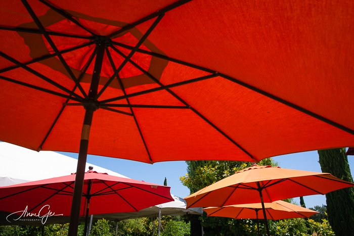
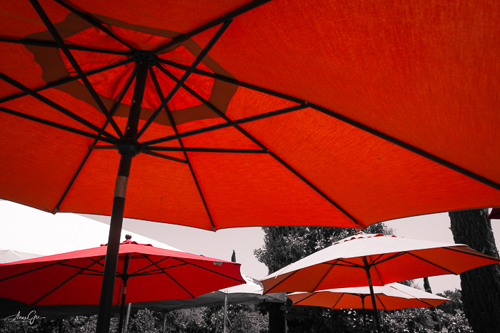
If I see red, I’m going to photograph it. These umbrellas are an example. The umbrellas take up most of the image with a large splash of color. It draws attention and, for me, is exciting.
The canopy below is a much smaller representation of red, but it still caught my eye. It is small and in the background. Even though it’s small, it’s bright enough to pull you into the frame.

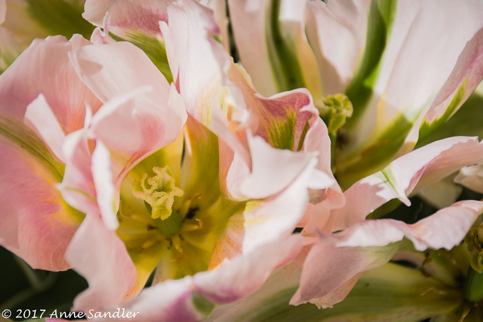
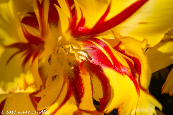
A photographed color can be soft and light, creating a sense of calm. Or, it can be bright, demanding our attention. These two flowers are an example of this. The soft pick versus the bright yellow and red. Which suits your mood? I know I said I’m not drawn to pink, but flowers are the exception.
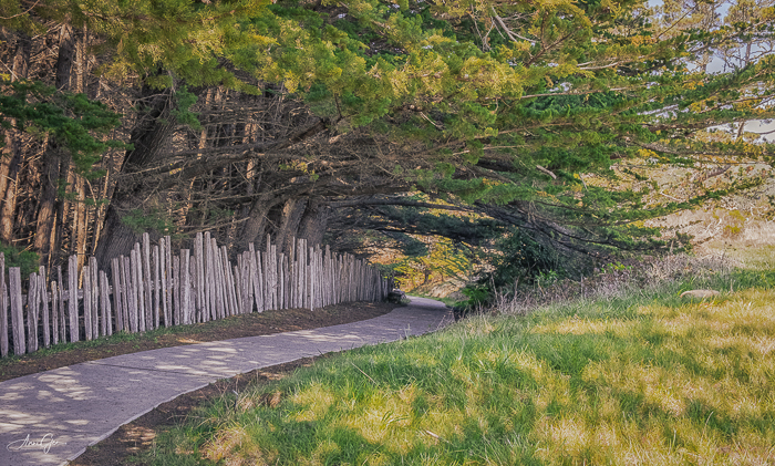
Color can also fill the frame, be solid, or lead us through the frame. The orange pumpkin dominates, leaving me feel excited and wanting to bake pumpkin bread. While the soft yellow on the ground and trees accents the branches and glides us along the pathway, having me feel at peace.

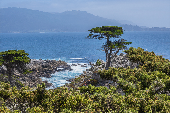
Mother nature often paints her landscapes in duotone so the subject can stand out as does this cypress tree against the blue ocean. I could sit a long time watching the waves crash onto the shore, creating a calmness within me.
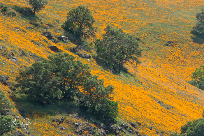
Or She paints a beautiful expansive vision of color as these poppies drape the hillside. This wild poppy field left me in awe of nature’s work.
I’m also drawn to rust which has a texture of its own, creating its own colorful patina. I can just feel the age of this wheel and admire its beautiful colors.

Before I close this challenge, I had a bit of color fun by processing selective color. This is the first time I’ve done this. Remember this photo, all that’s left in color are the red umbrellas. If you haven’t processed selective color, give it a try. It is fun!
And then there’s the rare “what is that!” Sometimes color surprises us. Wouldn’t you stop to take a picture of an old pink barn. Yes, even I did!

This week, show us how color affects your photography. What emotions does it bring to the surface? Which ones are you particularly drawn to? When you create your colorful expression, remember to link to this post and use the Lens-Artists tag.
Thank you, Sofia, for last week’s challenge that explained what bokeh is and how we use it as we photograph. We enjoyed seeing all your beautiful responses. Our guest host John RH, of John’s Space, will be presenting next week’s challenge. Be sure to visit his site.
If you would like to participate weekly in our Lens-Artists Challenge, just click this link and join us: https://photobyjohnbo.wordpress.com/about-lens-artists/

Anne, this has been such a hectic Easter week with many guests – but finally – here’s my offering! https://lagottocattleya.wordpress.com/2022/04/22/lens-artists-challenge-195-colourful-expressions/
LikeLiked by 1 person
Great reply to this challenge Ann-Christine. I hope your week was enjoyable as well as hectic. Take care.
LikeLike
It has, thank you!
LikeLiked by 1 person
Well, here I am at last. Thoroughly enjoyed these, Anne, especially the wild poppy field, and that old pink barn! Here’s my post: https://suejudd.com/2022/04/23/lens-artists-photo-challenge-195-colourful-expressions/
LikeLike
Great post Sue. Worth waiting for!
LikeLiked by 1 person
Thank you!!
LikeLike
Better late than not at all! Thank you for a fun challenge.
https://lindylecoq.com/2022/04/23/lens-artists-photo-challenge-195-colorful-expressions/
LikeLike
Hi Anne, This is a brilliant topic, Anne. Sorry, I’m so late, but I wanted to respond even if it was too late. BTW, I understand you are from Sac. Small world. We have family there.
LikeLiked by 1 person
I forgot to leave my post. https://alwayswrite.blog/2022/04/23/life-is-boring-except-for-coffee/, LOL
LikeLiked by 1 person