Color, that’s what it’s all about. It’s used to entice us to purchase items. We dress in colors that complement our complexion. And as photographers we always use color even if we process in black and white. This week, Egidio encourages to show us how we use complementary colors in our photography.
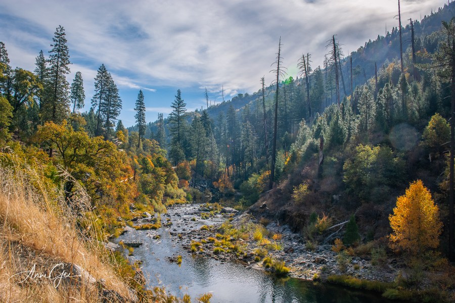
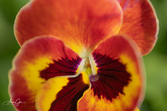
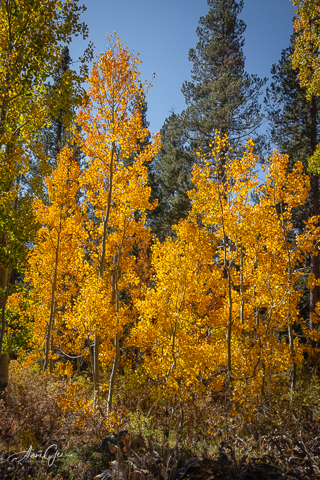
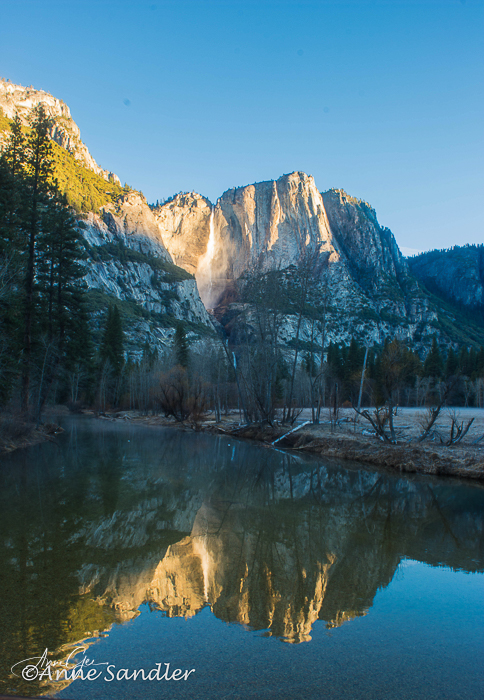
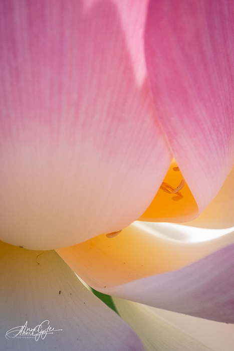
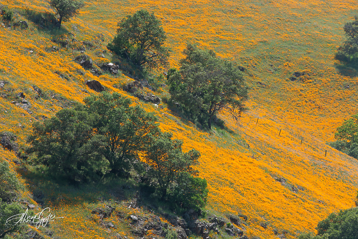
Nature gives us color every time we go out, especially complementary colors. First is green. What doesn’t complement green. On the color wheel colors shades of orange, red and purple complement green when you cast a wide net.
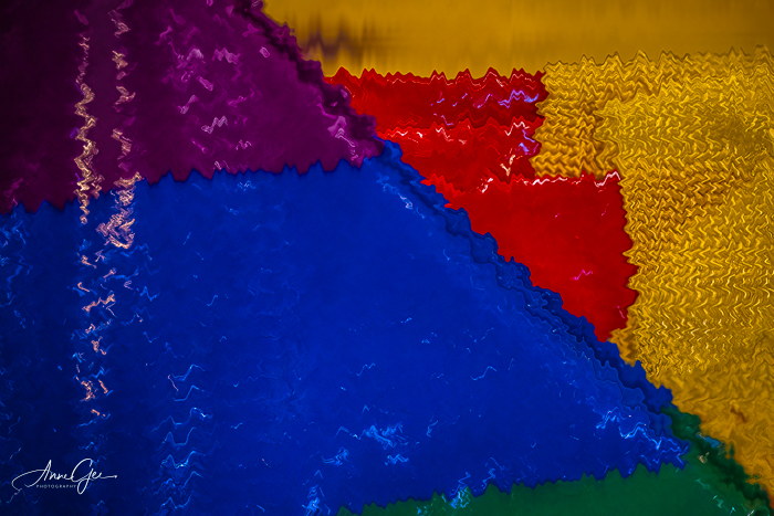
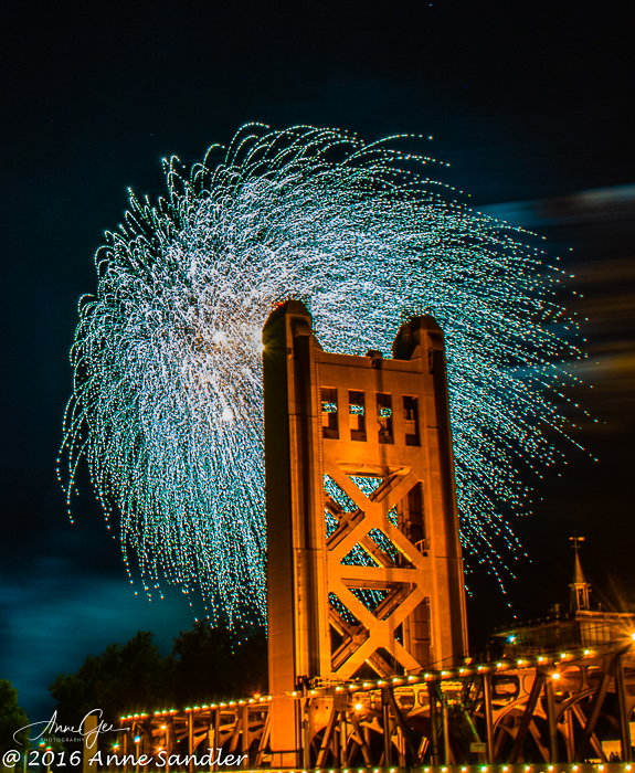
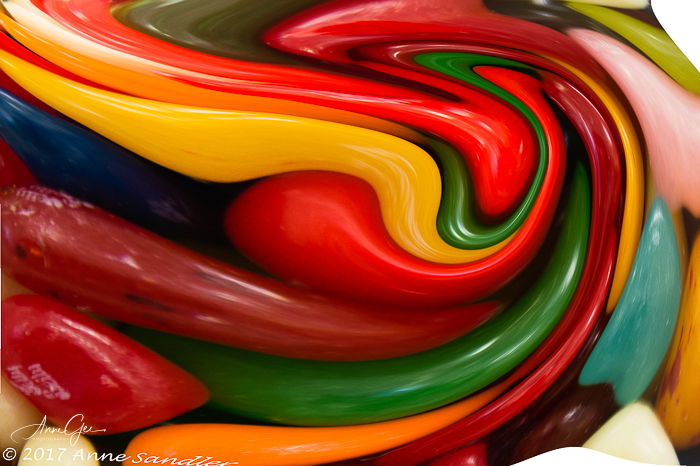
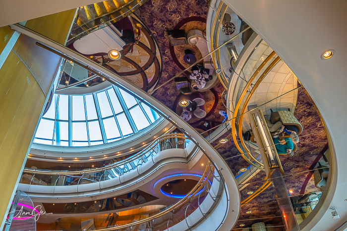
But we humans know how to use complementary colors also. From a seat cushion, to fireworks against a golden bridge, to an abstract and to a ship’s interior.
When you see ads, interior spaces or store fronts, think about how they use color. Thanks Egidio for this wonderful and colorful challenge. When you post your response, please link to Egidio’s post and use the Lens-Artists tag.
I enjoyed seeing your responses to Ritva’s post that had us looking down last week. You gave me lots of ideas! Next week Tina is presenting the challenge, so be sure to look for her post. In the meantime, stay safe and live in gratitude!