Like the “Little Engine That Could” I thought I’ll never find photos for this challenge. But when I re-read Patti’s post, I started thinking, “I Think I Can!”
So, I started searching and found some. Here’s what I found.
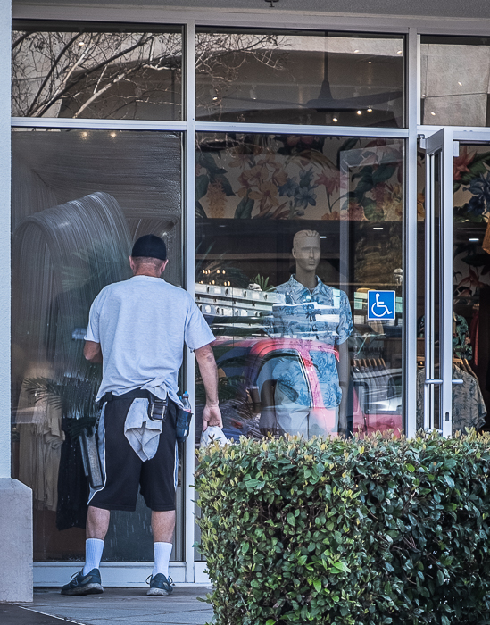
A very much alive window washer next to a store window mannequin. Taken at a local shopping center just before the stores opened. There are also a lot of reflections.
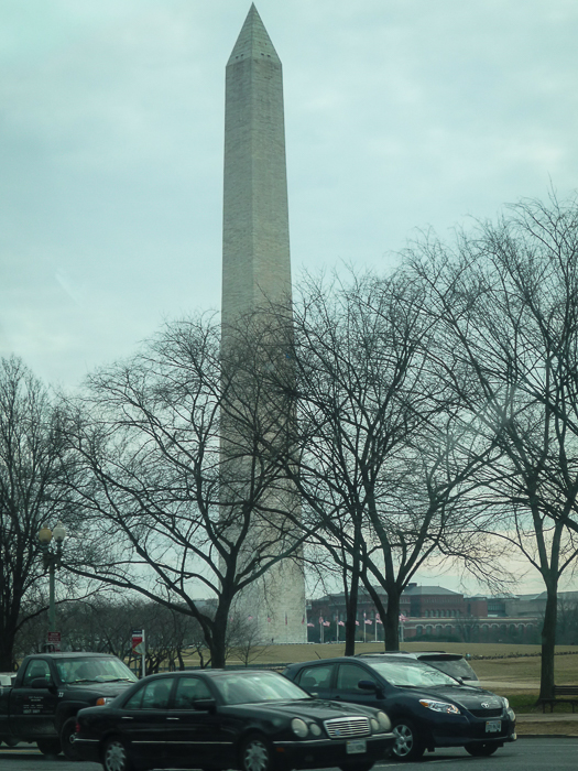
The Washington Monument towers above the tree line at the Capital Mall in Washington DC. This was taken just before President Obama’s inauguration and from a car window.
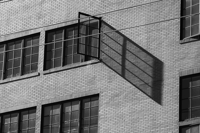
The shadow of a window appearing much larger than the actual window. Taken in downtown Sacramento.
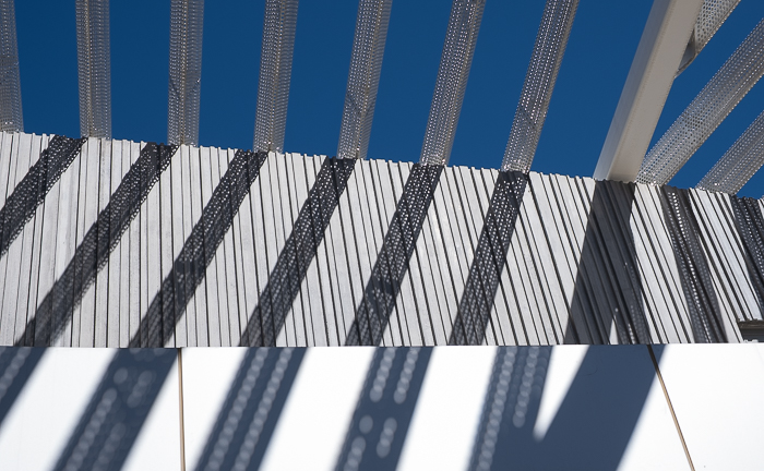
Shadows reflecting on various parts of a wall at the Manetti Shrem Museum of Art in Davis, CA (UC Davis campus). I love the different walls and how the shadow reflects on them.
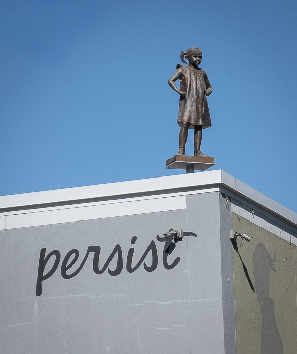
A sculpture of a small girl standing on a TALLish building, inviting you to be persistent.
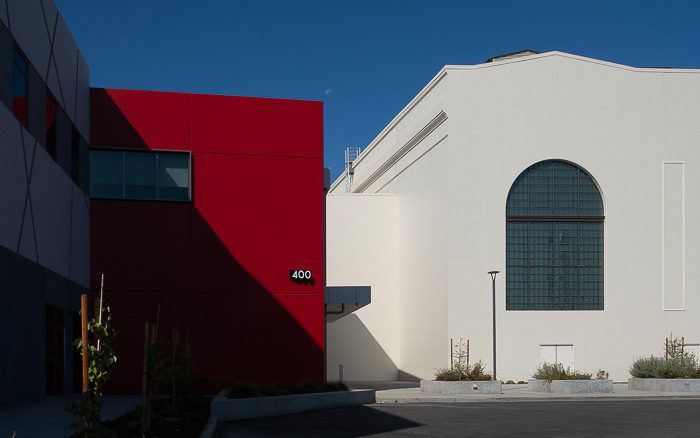
Here we have the juxtaposition of color, style and placement of the SMUD Museum of Science and Curiosity, This museum caters to grade-school children. SMUD is our Sacramento Metropolitan Utility District.
Thanks Patti for teaching me that when I “think I can,” I can! It was fun. Please remember to link to Patti’s post and use the Lens-Artist tag when you respond. We certainly had a “cropping” good time last week when Ritva gave us the encouragement to crop away! John is presenting our next challenge, so look for his post. In the meantime, stay safe and be resilient!
Not taking any photography classes, I learned by experience and asking questions of other photographers. That’s when I first heard of the Rules of Thirds, negative space, etc. But they were just names to practices I was already doing. Maybe it was my working for 20 years with a graphic artist. And loving bright colors, that came naturally.
With that explained, here are my examples.
My love for photographing buildings yields many lines and patterns. I like the blue sky against the brown building.
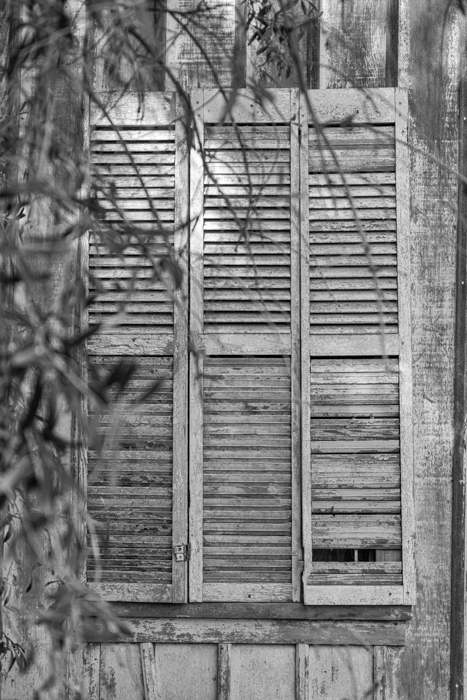
Small town street.The Barn = A concert venueWindow in an old house.A rooftop capture.
Fabrics have lots of lines and patterns.
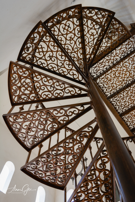
Have you noticed how stairs can also have patterns and circular lines?
I can’t forget ICM! Lines and patterns and color all over the place.
You’ll find lines and patters in the least obvious places. Like in a warehouse and a bridge.
And now for my favorite. This is a mural set in between two buildings. The sun, shade and reflections create lines and patterns on this beautiful image.
So there we have my journey through lines, colors and patterns. Thanks John having me delve into my archives for this one. This was a natural to follow Tina’s wonderful post asking us how we “Live and Learn.” I enjoyed see all your responses. As usual, please remember to link your response to John’s post and use the Lens-Artists tag. Next week Ann-Christine will lead the challenge.
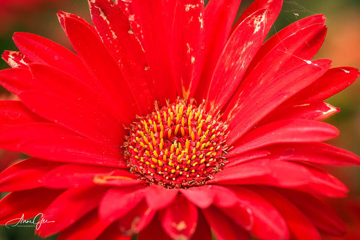
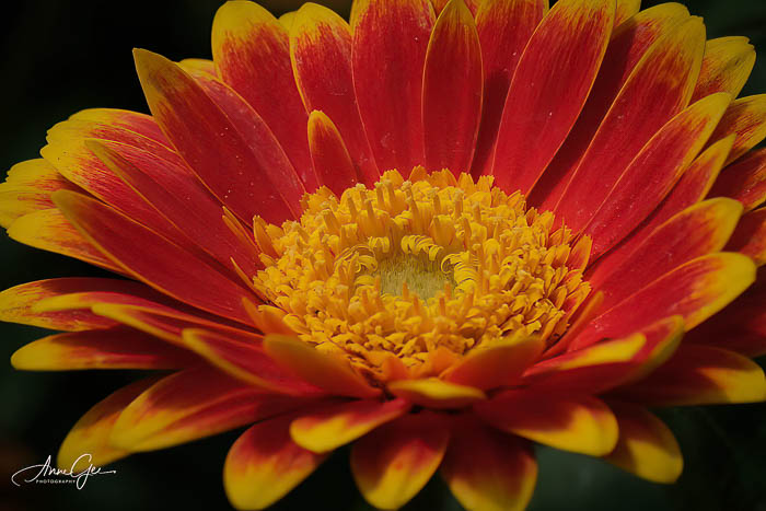
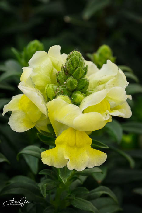
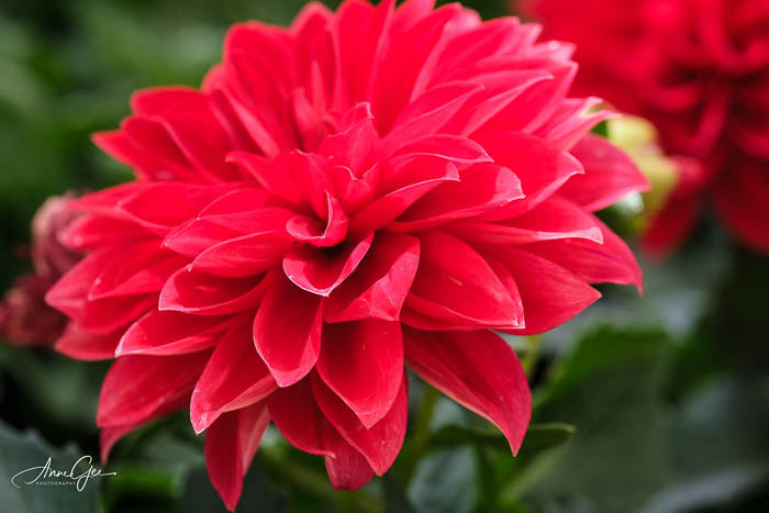
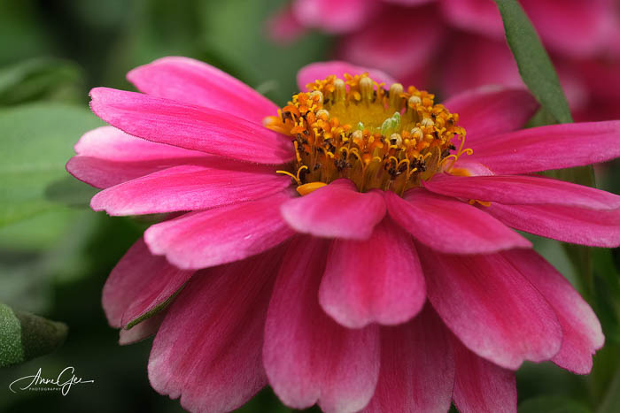
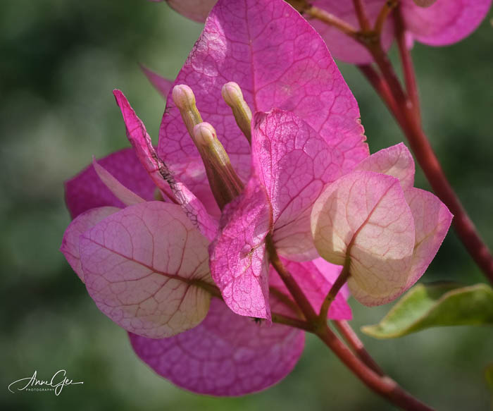
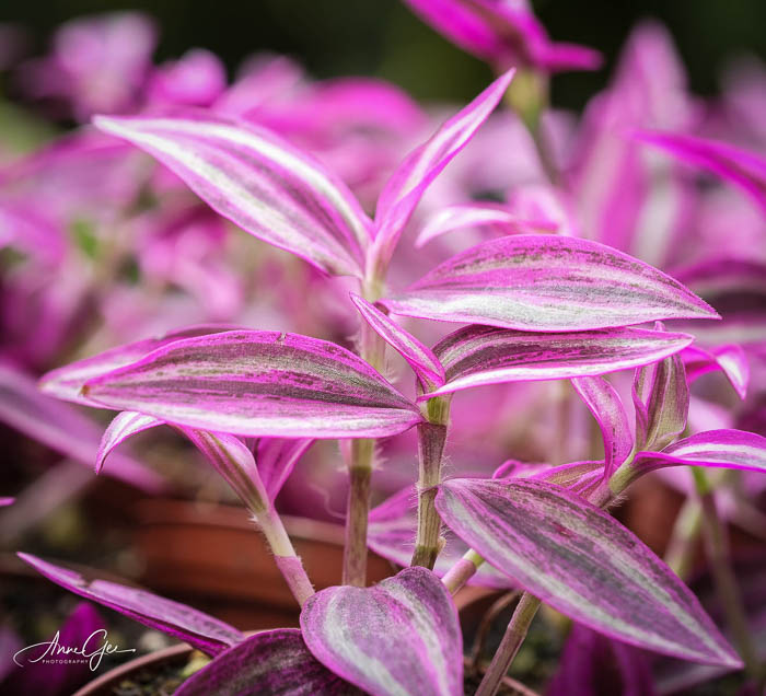
My macro lens has been sitting in the camera case for a long time. It must have been calling to me because I got the sudden urge to take it to my local Green Acres Nursery. They don’t mind photographers walking around with cameras.
I was there about an hour, taking pictures. I focused on the task, and left relaxed, feeling good and not thinking about what’s happening in the world. Here are some of the beauties I photographed.
I hope these flowers relax you as taking their photos relaxed me. Take care and live in gratitude.
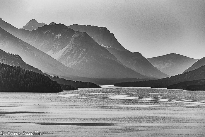
Is monochrome black and white? Is black and white monochrome? You may be surprised at the answer. I was after I did some research. Here’s what I found.
Black and white is the result of only using black or white and shades of. The shades of meaning grayscale. Here are some black and white photographs.
Monochrome photos contain variations of only one color and nothing else. Meaning, different shades of one color like blue, red, green, etc. Here are some of my examples.
Now here’s something I learned from my research. Since black and white photos contain variants of the color gray ranging from absolute black to absolute white, all black and whites are monochrome images. But not all monochrome, by nature of their dominate color are black and white photos.
Here are some of my photos shot in color, converted to black and white and then I added a sepia tone. This process puts them in the monochrome category.
How do you shoot black and white images? My research suggests that we shoot in color, so we get the additional tonal range that color provides. Then convert your photos to black and white when you process. I photograph in color. If I see a great deal of contrast, I use Lightroom to take a quick look at how it would look in black and white. Then I edit in NIK Silver Efex.
There’s so much more to editing black and white images, but let’s save that for another post. Here are two of my favorite black and white images.
Are you ready to show off your black and white or monochrome images? I’d like to see them. Did you shoot them in color and how did you process them? When you post, remember to link to this post and use the Lens-Artists tag so we can find your wonderful images.
I enjoyed seeing all your photos using primary colors. Sofia gave us such a fun challenge. Next week, Donna will be challenging us. Be sure to look for her post.
If you would like to participate weekly in our Lens-Artists Challenge, click here for more info.
Color! It motivates, depresses, and makes us happy. Marketing companies know the effect color can have on our emotions. Just look how it’s used in print and television ads. Bright colors are usually used to get us to buy—now. More subdued colors are used to relax us and encourage us to come in for that spa treatment. How do you react to these subliminal motivators?
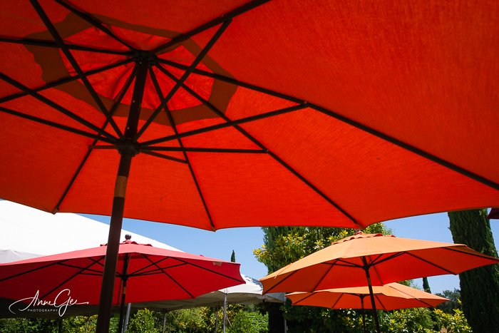
Better yet, how does color affect your photography? How we photograph is reflective of how color motivates us. I like bright bold colors, red being my favorite. In fact, as I write this post, I’m wearing a red blouse. I shy away from pastels, and you’ll never see me wear a soft pink! But, back to photography. My personal preferences are carried forth in what I choose to photograph.
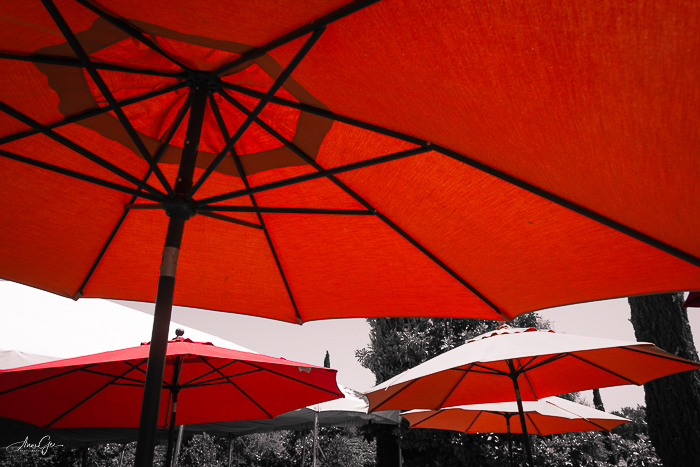
If I see red, I’m going to photograph it. These umbrellas are an example. The umbrellas take up most of the image with a large splash of color. It draws attention and, for me, is exciting.
The canopy below is a much smaller representation of red, but it still caught my eye. It is small and in the background. Even though it’s small, it’s bright enough to pull you into the frame.
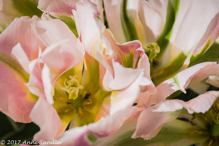
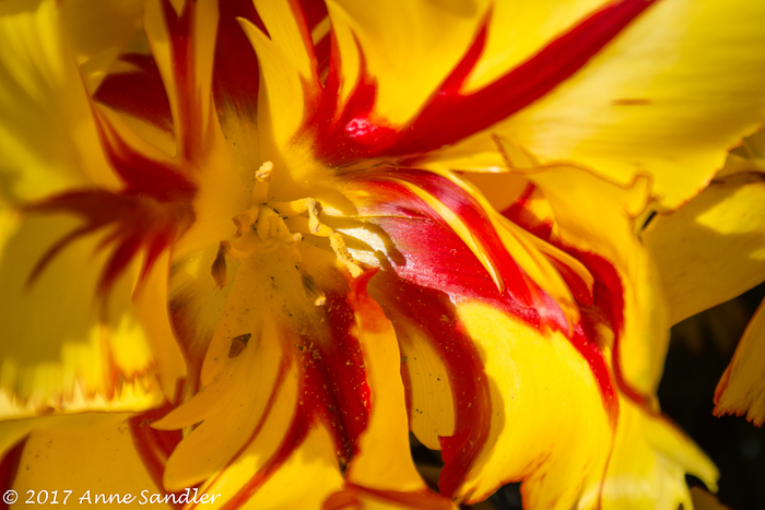
A photographed color can be soft and light, creating a sense of calm. Or, it can be bright, demanding our attention. These two flowers are an example of this. The soft pick versus the bright yellow and red. Which suits your mood? I know I said I’m not drawn to pink, but flowers are the exception.
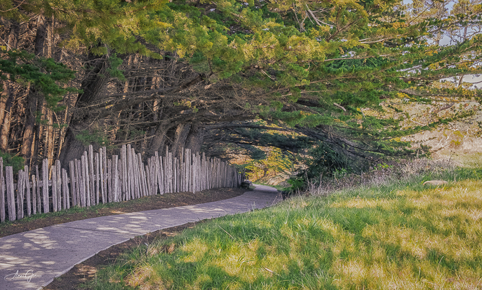
Color can also fill the frame, be solid, or lead us through the frame. The orange pumpkin dominates, leaving me feel excited and wanting to bake pumpkin bread. While the soft yellow on the ground and trees accents the branches and glides us along the pathway, having me feel at peace.
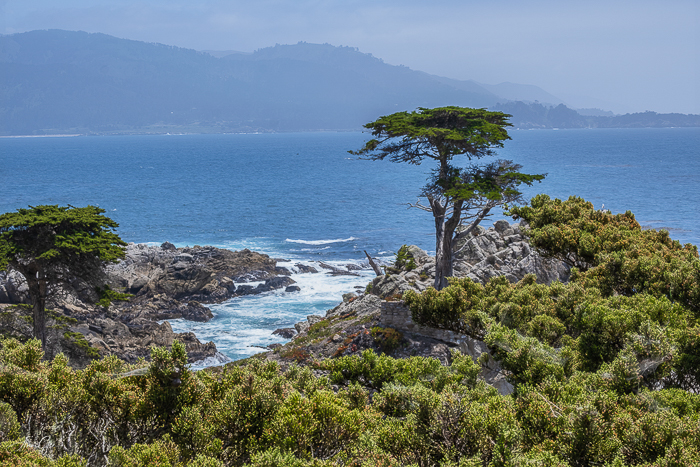
Mother nature often paints her landscapes in duotone so the subject can stand out as does this cypress tree against the blue ocean. I could sit a long time watching the waves crash onto the shore, creating a calmness within me.
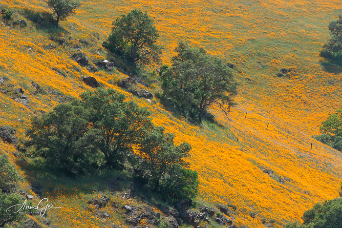
Or She paints a beautiful expansive vision of color as these poppies drape the hillside. This wild poppy field left me in awe of nature’s work.
I’m also drawn to rust which has a texture of its own, creating its own colorful patina. I can just feel the age of this wheel and admire its beautiful colors.
Before I close this challenge, I had a bit of color fun by processing selective color. This is the first time I’ve done this. Remember this photo, all that’s left in color are the red umbrellas. If you haven’t processed selective color, give it a try. It is fun!
And then there’s the rare “what is that!” Sometimes color surprises us. Wouldn’t you stop to take a picture of an old pink barn. Yes, even I did!
This week, show us how color affects your photography. What emotions does it bring to the surface? Which ones are you particularly drawn to? When you create your colorful expression, remember to link to this post and use the Lens-Artists tag.
Thank you, Sofia, for last week’s challenge that explained what bokeh is and how we use it as we photograph. We enjoyed seeing all your beautiful responses. Our guest host John RH, of John’s Space, will be presenting next week’s challenge. Be sure to visit his site.