This is a dilemma we all face–color or black and white (AKA Monochrome). Patti suggests, for this challenge, that we show a maximum of three images processed in both color and black and white.
When I compose a photograph, I don’t think color or black and white. That time comes during processing. Since I mainly use Lightroom, if I think there’s enough contrast, I will use the black and white button in LR just to see what it would look like. If I like it, then I process the image using LR and Silver Efex.
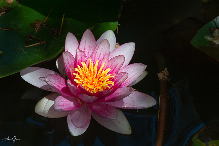
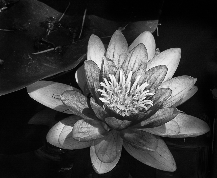
I photographed this water lily and wondered what it would look like in B&W. I liked the drama that was created and finished processing in Silver Efex. Do you think the contrast in the leaves makes up for the loss of color?
Sometimes, an overcast day presents an almost B&W image on its own. This was taken in Bodega Bay on the California Coast. I thought the dark boat, clouds and light shining on the water created enough contrast for a B&W image. But then the color image looks right also. What do you think?


Finally, not knowing Patti was going to present this challenge, I challenged myself to a sunset in B&W. What would a beautiful, colorful sunset look like in monochrome? See for yourself.
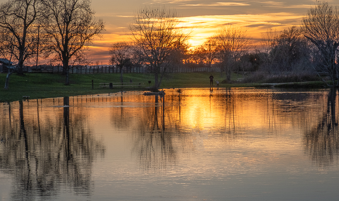

I think the monochrome works mainly because of the reflection in the water. But is working good enough? What do you think?
This has been a great exercise Patti. Thank you! When you post your responses, please link to Patti’s original challenge and use the Lens-Artists tag. I’m anxious to see your posts. Last week, we saw a lot of dogs and cats thanks to Tina’s challenge. It was fun to see your pets and grand pets. Next week Ann-Christine will challenge us, so please look for her post.
In the meantime, be resilient and live in gratitude.

I hate saying which one I like more or less, as I think they all have their pros and cons. I think you just look at the images differently. Great examples Anne.
LikeLiked by 1 person
Thanks Leanne! I know what you mean. The moods are different which gives each image a different story. It just comes down to what you like.
LikeLike
Anne, the photos are great. Each one could be its own preferred choice. However, side by side, I have my preferences. The flower is definitely more dramatic as a monochrome. The color version is beautiful, but I’d pick the black and white. There’s more drama and impact to my eyes. The same goes for the boat. I do not think that comparing the two versions leaves the blue sky uneventful. On the other hand, the black and white is more serene and creates an aura of mystery — probably with the silver colors being more noticeable in black and white. As for the final image, I can’t run away from the color version. The monochrome loses the intensity my eyes want to see. Great images and edits!
LikeLiked by 1 person
Thanks Egidio! Each photo, individually, tells a different story. I agree with you on the sunset, but I just had to try it!
LikeLike
Your sunset try got a bug in my ear now. I’ll have to try that.
LikeLiked by 1 person
I honestly think this is like comparing apples to oranges. I know they are the same image but they each carry their own strengths and weaknesses. In other words they are each VERY different photos.
LikeLiked by 1 person
I totally agree with you Dawn. Each type of processing tells a different story. I guess it depends on the photographers interpretation. Thanks!
LikeLiked by 1 person
For me, the flower and the sunset are both equally great. The boat in black and white has the edge for me
LikeLiked by 1 person
Thanks Teresa! I’m curious, what do you mean when you said “the edge?” I’m glad you liked the sunset. I’m still not sure about it.
LikeLiked by 1 person
I just meant that I like the boat in b&w better. Sorry I didn’t explain it well.
LikeLiked by 1 person
Thanks for explaining. I like the B&W better too.
LikeLiked by 2 people
I’m surprising myself by enjoying the monochrome images in the responses I’ve so far seen very much. And yours are no exception. My favourite though is your water lily.
LikeLiked by 1 person
Thanks Margaret! As I said in my post, I love monochrome. The water lily was my first attempt of processing a flower in B&W.
LikeLiked by 1 person
And a good attempt too!
LikeLiked by 1 person
Good
LikeLiked by 1 person
Thank you!
LikeLiked by 1 person
Excellent choices Anne. For me, I prefer all of the images in color. But if this week is teaching me anything, it’s that each person has his or her own personal preferences. An excellent example of that is the variety of responses to each post! Beautiful choices for the week.
LikeLiked by 1 person
Thanks Tina! It’s all subjective. This week should be interesting.
LikeLiked by 1 person
Brilliant job capturing these images both in color and in B&W, Anne. The sailboat shot in B&W yields the distant hill in the background, not as evident in the color shot. Great examples!
LikeLiked by 1 person
Thanks Terri! B&W does show the contrasts better than color, and without color to distract, other features are more prominent. This was a fun exercise.
LikeLiked by 1 person
Waterlily has to be in colour for me. Too much is lost in monochrome, still beautiful but I’d have the vibrant colours every time! The other two are so beautiful and timeless in both versions, Anne.
LikeLiked by 1 person
Thanks Sofia! I’m attracted to vibrant colors also, but a good B&W always draws me in.
LikeLiked by 1 person
Like Sofia, I prefer the lily in color, but the other two images work well in B&W. Well done Anne.
LikeLiked by 1 person
Thanks Brad!
LikeLiked by 1 person
For all I like them, but the lotus I think is best in color – black and white makes the detail too harsh. (IMO) Nice work!
LikeLiked by 1 person
Thanks N! Since that picture, I try to process flowers in B&W with some success.
LikeLiked by 1 person
What software do you use to process your pictures? Sometimes I decrease the contrast a bit, as well as soften or blur a flower. Once I do that, a bit of decreasing the highlights, for a bit of subtle detail, helps, and even increasing the whites. I use LR primarily myself. Now you have me thinking!!
LikeLiked by 1 person
I use Lightroom mostly. When processing in B&W I process in color and then put it in NIK Silver Efex. I do have to work on softening flowers. Thanks for the reminder!
LikeLike
These photos look stunning in black & white or colour!
LikeLiked by 1 person
Thank you!
LikeLike
All look great in b/w!
LikeLiked by 1 person
Thanks Nora!
LikeLiked by 1 person
💗💗💗
LikeLiked by 1 person
Excellent choices, Anne! NIce to see the comparisons.
LikeLiked by 1 person
Thanks Amy!
LikeLike
That lovely pink water lily is a standout in color, however the B&W holds its own with the shadows and veining of the petals. I prefer the color version of the sailboat. Now that sunset – I absolutely adore sunset photos and this one is stunning. At the same time, the B&W draws my attention to the tree branches and their reflection in the water which is also striking. Still, of the two, I wish I’d taken the color shot!!!
LikeLiked by 1 person
Thanks Lindy! I agree with you all the way. Somehow, there’s just a hint of color in the sail boat to make a difference. The flower in monochrome allows us to see more of the petal structure and the sunset is a toss up, leaning to the color version. Actually, I didn’t expect the monochrome to come out as good as it did.
LikeLiked by 1 person
The last one is my favorite here because both features a unique perspective of the sky’s reflection on the water. Just wonderful 🙂
LikeLiked by 1 person
Thanks Hammad! I wanted to see how a vibrant sunset would translate into monochrome. I think it turned beautiful into dramatic.
LikeLiked by 1 person