I am delighted to be your guest host for this week’s LAPC. Thank you John for getting us into/onto the water last week.
As much as I enjoy photographing water, I also love black and white photography! I don’t process a lot of it, but when I do I enjoy the texture and depth it gives a scene. It reaches a place in your soul that color can’t. Some images cry out for black and white.
This post is not a “how to” or history lesson, but a vehicle to get you excited about processing in black and white. As photographers, we all have our own unique way of doing that. Some shoot in black and white while others shoot in color and process in black and white.
I’ve watched many videos and attended workshops on black and white photography only to realize there is no set way to create a good black and white image. I have, however, settled on a workflow that produces the results I like. This is my workflow.
First, I always shoot in RAW and in color. That gives me more flexibility and more tonal range to work with. Very rarely do I see the image in black and white before I shoot it. I mostly see color until I get it into Lightroom.
This fog landscape I saw in black and white as I shot it. One of my rare moments.

Once I get my images into Lightroom, I process them in color. If I see an image with a lot of contrast, texture, and tonal quality, I finish the color processing and then look at it in black and white in Lightroom. If I see a possibility for a good black and white, I transfer the color image into Nik Silver Efex. This is where the fun begins.
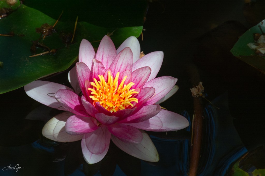
Here’s a lily in color and black and white. Look at how the various colors, contrast and lighting transfer in tonal quality to the black and white.

Although Photoshop and Lightroom have improved in their ability to process black and white, I still prefer Nik’s Silver Efex. I guess I’m just used to it and I like their presets. Better yet, I need their presets! I’m not an artist. I choose a preset and work on it from there. Nik also has the ability to use more than one preset on a single image. You can use the control points to dodge and burn (darken and lighten). I rarely do this but work more with the contrast and tone of the image. If you like different film effects, there are many film types and tones from which you can choose. Honestly, I don’t change film types but, sometimes, will give an image a different tone color.
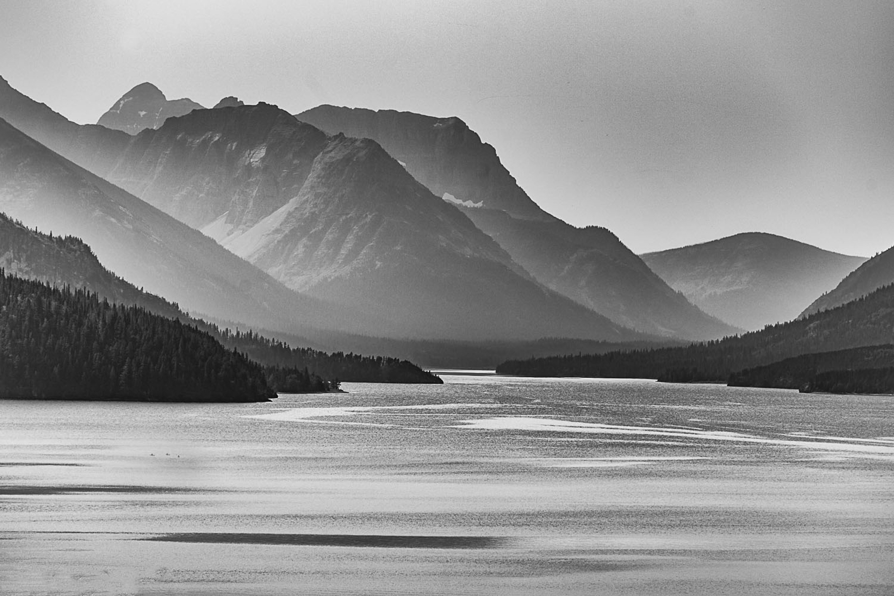
This is the color version of Waterton Lake, Waterton Lakes National Park of Canada. A foggy day and not much color.

The same image processed in black and white. Adding texture and contrast, created a more inviting image.
While in Silver Efex you can also add texture and do other editing that I prefer to do in Lightroom.
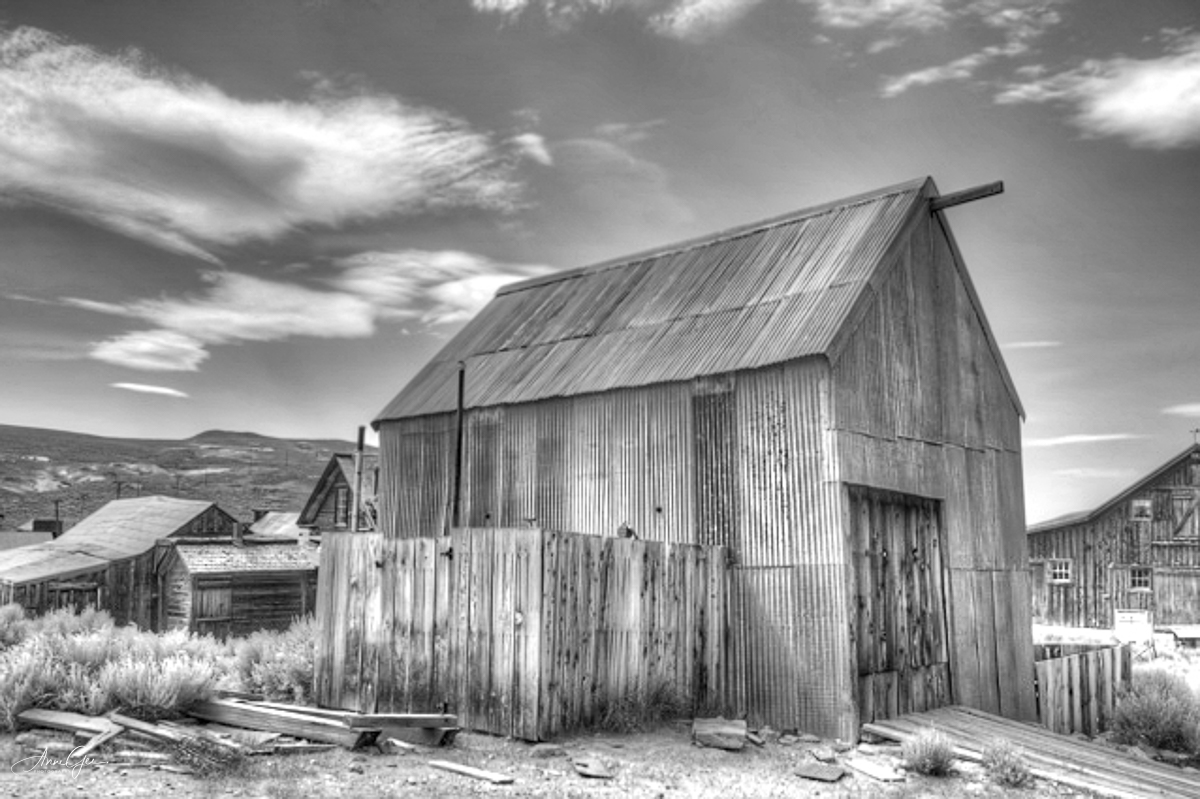
Sometimes the venue calls for black and white photography. One of my earlier black and white images taken while at Bodie a ghost town in Northeastern California.
Here’s another where I think the black and white conversion accents the splash of the wave on the platform. Taken in Pacifica.

Once I’m done in Silver Efex, I then export the image back into Lightroom for the finishing touches. I sometimes continue working on the contrast and light. I love how Lightroom’s tone curve helps with that. For me I like images to have some “pop!”
Also figures in shadow are accented in black and white. This image was taken at the Marin Headlands during one of my first Meetup outings.

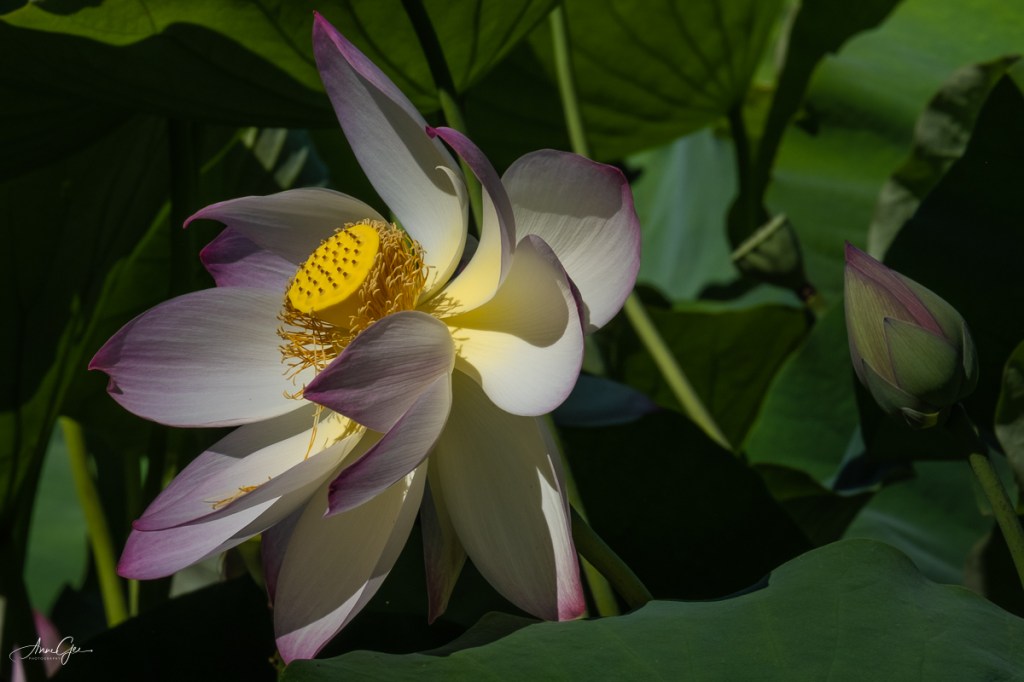
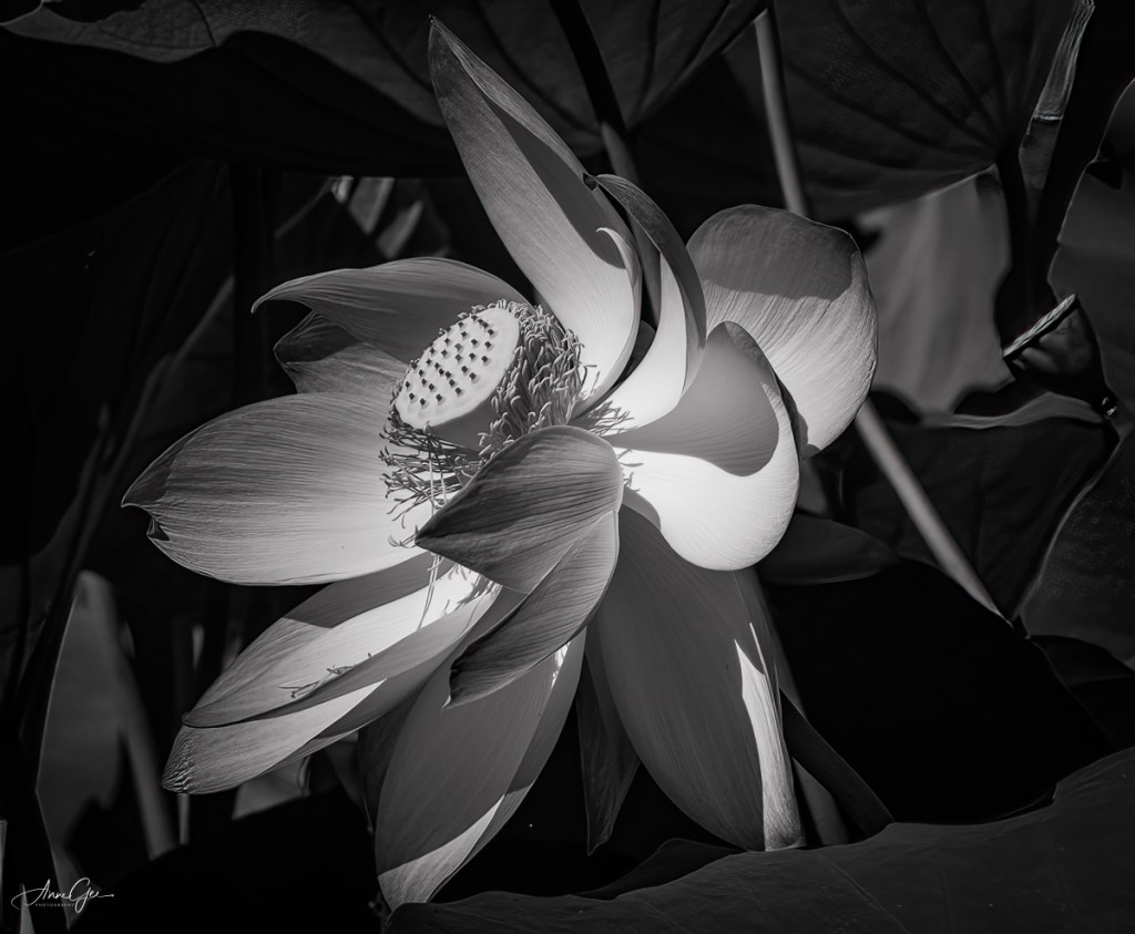
Back to the present, my latest black and white conversion is a lotus in the William Land Park pond. It’s beautiful in color, but how do you feel (Yes, feel it not think it!) about it in black and white? For me, the curves, contrast and lighting are accented.
So, this is my method for processing an image to black and white. I’m sure you have your own workflow for black and white photography, and I’d like to know what it is and see your images. This week’s challenge invites you to dig through your archives for black and white images or process color images in black and white. You can also take new pictures and process them in black and white.
As you post them, please explain how you processed them. This will help all of us learn new ways of doing what we’ve been doing for a long time. I hope you are now ready to see the black and white possibilities as you shoot and/or process.
Thank you, Tina, Amy, Ann-Christine and Patti, for giving me this opportunity. I do appreciate it!
Remember to link this post and use the Lens Artists tag. Next week’s challenge will be presented by Rusha Sams of Oh The Places We See: Getting Away.
She will be followed by:
July 24: Beth Smith of Wandering Dawgs: TBD
July 31: Ana Campo of Anvica’s Gallery: Postcards

Beautiful work. I wrote my comment on your blog post!
LikeLiked by 1 person
What a lovely, informative post! I’m just now “warming up” to black and white photos since I’m a color person, so to speak. But if anyone needed any convincing to the power of black and white, this post should do it. I’m most fond of Waterton Lake — the silhouettes, peaks, etc. are highlighted with your techniques.
Thanks, too, for the detailed information and techniques from which we can all learn. I’ll start looking now for black and white examples to share.
LikeLiked by 1 person
Thank you Rusha! I’m so glad you’re now excited about black and white processing. I’m waiting to see your images! Have fun with it.
LikeLiked by 1 person
Anne, thanks for hostessing. I love when the themes are announced in advance because Saturdays I usually have things to do other than work on a post. Your photos are wonderful but I realize when an amateur I am as I really have little to post about how I process my photos. Some were taken with an iPhone and other than cropping, sometimes adding a frame or vignette, or making them black and white, I do very little. I don’t have Lightroom, Nik or any of those things. I use Picasa (free) or Pixlr (also free.) Be that as it may, here are my offerings for this week. 🙂
janet
LikeLiked by 1 person
Oh Janet. First thanks for responding to this post so quickly. I saw your blog post before I saw this comment and was awestruck! Check out my comment. And, you’ve answered my request on processing.
LikeLiked by 1 person
Just added what I said here to my post. 🙂
LikeLike
How interesting! I much prefer both your flower photos in colour. The lake landscape is amazing in black and white though. I used to convert but realised I was no good at it, I love my colours too much, but will see what I can do. Also I don’t postprocess for longer than three minutes (using only my trusted Windows Photo Gallery).
LikeLiked by 1 person
Thanks MMM! I can see from your previous posts that you are into color and that’s great. Photography is so subjective, and not everything converts well into black and white. I’m so glad you enjoyed the lake.
LikeLiked by 1 person
Great topic. Very nice images. I love especially your Waterton Lake image. My collection is here: https://solaner.wordpress.com/2021/07/10/lens-artists-photo-challange-156-black-and-white/
LikeLike
Thanks Solaner! I visited your blog and just loved your work. Read the comment I left.
LikeLiked by 1 person
You’re welcome, Anne. Yes, I love bw images. In the 1980s I run my own lab (bw only). It is so much more, then simply desaturating colours. You can develop an eye for bw. This can also bring some progress for your photographic eye.
LikeLike
Beautiful work, Anne. And I mean it. I also take raw images and do my black and white from there. I do everything in Photoshop though.
LikeLike
Thanks Alessandra! Photoshop still scares me, but I do like the new sky replacement tool.
LikeLike
Anne, thanks for inspiring me to try new things. I love and respect your photography for its quality and unique combinations. Here’s my post on this week’s theme of Black and White: https://ohtheplaceswesee.com/2021/07/10/lens-artists-photo-challenge-156-black-and-white/
LikeLike
Thanks Rusha! Your post also inspired me. Check out my comment! Looking forward to next week!
LikeLiked by 1 person
SUSTAINABILITEA: 😊😊😊
LikeLike
This is a lovely lesson and your photographs are beautiful and very dramatic. Thanks for hosting this week, Anne.
LikeLike
Thank you Marsha and you are welcome!
LikeLiked by 1 person
🙂
LikeLike
Thank you! See my comment on your blog post which was great.
LikeLike
Hi Anne
I love both versions of your photo of Waterton Lake. The moods are so different it is almost as though they are not the same ‘lace at all. What a very effective use of texture and contrast editing! Your Lotus in the William Land Pond park is gorgeous. Wonderful challenfe this week.
Here’s one from me wherein conversion to B&W evokes an ancient bird instead of a modern-day Great Blue Heron:
https://babsjeheron.wordpress.com/2021/07/10/great-blue-heron-time-stands-still/
Best, Babsje
LikeLike
Thank you Anne for these remarkable black and white images! Appreciate you taking time to explain the process. I’m inspired. A great post!
LikeLike
Thanks Amy! I’m glad you liked the post. Are you ready for some black and white?
LikeLiked by 1 person
It will be up tomorrow morning. 🙂
LikeLike
Hi Anne,
Thanks so much for hosting. Here is my post for this week.
LikeLike
Marsha, see my comment on your blog post. 😊😊😊
LikeLiked by 1 person
Thanks, Anne. 🙂
LikeLike
I don’t see my pingback but I’m sure it will show up eventually, here’s mine: https://photographyocd.com/2021/07/10/goats-head-soup/
LikeLike
Mike your goat in black and white was amazing!
LikeLike
Thanks Anne, I have a similar photo of him in a museum in Estonia. I told him that but he didn’t seem to care. 🐐
LikeLike
GREAT images. B&W can be VERY artistic. Well done.
LikeLike
Thank you John!
LikeLiked by 1 person
I visited your post and left a comment. Well done!
LikeLike
Just in case my ping-back go lost in space
https://myforever.blog/2021/07/10/having-fun-while-waiting-for-the-end-of/
LikeLike
Hi – thanks for hosting – and fun theme – I like all of your images but especially the beach photo 🙂
LikeLike
Thanks Prior! I loved your trees in black and white.
LikeLiked by 1 person
Thanks so much Anne ☀️☀️
LikeLike
Wonderful post! Very interesting. Love your examples, the black and white lotus acquires an exquisite depth.
LikeLike
Thank you Ana!
LikeLiked by 1 person
You’re welcome! Glad you enjoyed it!
LikeLike
Interesting to read about your creative processes. Difficult to pick, but there’s something about the Bodie ghost town photo…
Here is mine:
LikeLike
Fantastic images, Anne 👏 The transformation of the Lake shot is amazing & the header image is stunning in B&W 😃 A slightly different approach from me: https://jezbraithwaite.blog/2021/07/11/actually-in-colour-lens-artists-challenge-156/
LikeLike
Wow, I completely ignored looking at my flower images with the idea of black and white conversion. Your flower images above have shown me how wrong I was. The good news is that now I have a whole new venue of images in my gallery to explore.
I am also a fan of black and white, and our workflows are amazingly similar. I just finished a special set of Black and White images prepared for this challenge. I will write up the post and have it online on Thursday.
Great challenge topic!
LikeLike
Thanks John! Have fun converting some of those flower images to black and white! I’ll look for your post on Thursday.
LikeLiked by 1 person
I added one floral attempt to convert to black-and-white. As I saw in your examples, you’ve picked some flowers that look especially nice when converted. Going through my library, I found very few examples of flowers that converted nicely. 🙂
LikeLike
I really am not to well versed on the technical side of this topic. I am just an amateur that loves taking photos. So here is my take on the topic and hopefully I did alright. https://mywanderings.travel.blog/2021/07/11/black-white/
LikeLike
Check the comment I left on your post.
LikeLike
The change of the image of Waterton Lake is amazing.-
https://geriatrixfotogallerie.wordpress.com/2021/07/11/black-and-white-5/
LikeLike
Thank you!
LikeLiked by 1 person
Great challenge and thank you for hosting, Anne! I always shoot in color because sometimes a subject I think will look good in B & W, doesn’t. Pictures might look better in sepia tone or with other processing. I use Corel PaintShop Pro to convert images to B & W. I almost always bump up the contrast. I liked your last image of a flower because its interesting structure is highlighted in B & W. Here’s my contribution this week. https://bendbranches.com/2021/07/11/creatures-of-the-mist/
LikeLike
Your photos were beautifully accented in black and white!
LikeLike
See my comment on your post.
LikeLike
Hi Anne, Here is my contribution: https://shareandconnect.wordpress.com/2021/07/11/lens-artists-challenge-156-black-and-white/
LikeLike
Anne, thank you so much for this challenge! All of your images are wonderful but I think the black and white image of Waterton Lake is my favorite.
LikeLike
Thanks Beth!
LikeLiked by 1 person
The sharpness and detail of the lily are stunning, Anne. I look forward to participating in your challenge. My workflow is identical!
LikeLike
Thanks Susan! Looking forward to seeing your post.
LikeLike
What an excellent challenge! It really made me take my time over some edits, as I was noting down what I did at each stage – very interesting: https://www.toonsarah-travels.blog/seeing-shrewsbury-in-black-and-white/
As to your photos, I totally agree about having some pop! I love what you’ve done with the Waterton Lake shot and that old building in Bodie is perfect in black and white. I also really like the B&W lotus – for me it has an air of mystery that the colour shot lacks 🙂
LikeLiked by 1 person
See my comment on your post!!
LikeLike
See my comments on your post!
LikeLike